Why Your Website Must Have Responsive Designs? Hire Best Design Agency in USA
In today's digital age, having a website that is not only visually appealing but also functional across various devices is no longer just a bonus – it's a necessity. In the era of smart phones, tablets, and other mobile devices, users expect seamless experiences regardless of the screen size they're using. This is where responsive web design comes into play.
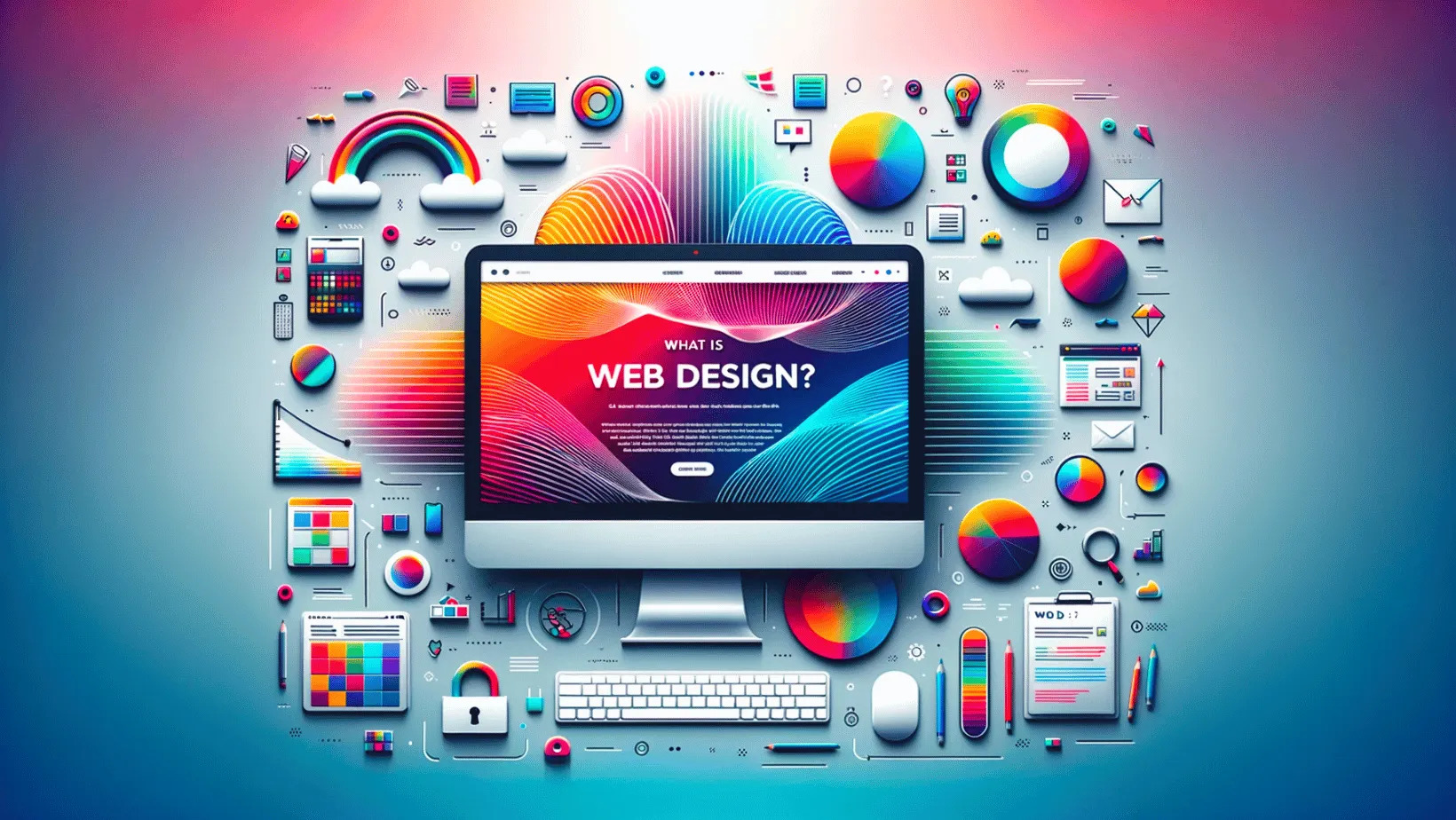
What is Responsive Web Design?
Responsive web design is an approach to web design that ensures a website's layout and content adapt fluidly to the screen size and device orientation of the user. Instead of creating separate websites or versions for desktop and mobile users, responsive design allows for a single website to dynamically adjust its appearance based on the device being used.
Enhanced User Experience
One of the primary benefits of responsive web design is the enhancement of user experience (UX). By providing a consistent and optimized experience across all devices, responsive websites reduce bounce rates and increase engagement. Users are more likely to stay on a website that is easy to navigate and read, regardless of whether they're accessing it from their desktop at work or their smartphone on the go.
Improved SEO Performance
Responsive web design also plays a crucial role in search engine optimization (SEO). With Google's mobile-first indexing approach, which prioritizes the mobile version of a website for ranking purposes, having a responsive design is essential for maintaining visibility in search engine results pages (SERPs). Additionally, responsive websites are more likely to receive backlinks and social shares, further boosting their SEO performance.
Cost-Effectiveness
While the initial investment in responsive web design may seem daunting, it's important to consider the long-term cost-effectiveness of this approach. Rather than having to maintain multiple versions of a website for different devices, responsive design streamlines the development and maintenance process, saving both time and resources in the long run.
Adapting to Future Technologies
As technology continues to evolve, so do the devices and platforms that people use to access the internet. With responsive web design, your website is prepared to adapt to whatever the future may bring. Whether it's foldable phones, wearable devices, or augmented reality glasses, responsive design ensures that your website remains accessible and functional across new and emerging technologies.
Accessibility and Inclusivity
Another important aspect of responsive web design is its role in promoting accessibility and inclusivity. By ensuring that your website is usable by people of all abilities, including those with disabilities, you can reach a broader audience and demonstrate your commitment to diversity and inclusion.
The Importance of Mobile Optimization
With mobile devices accounting for an increasing share of internet traffic, optimizing your website for mobile users is essential. Responsive web design allows you to provide mobile users with a seamless browsing experience, improving engagement and conversion rates.
Responsive web design is no longer just a trend – it's a necessity for any website looking to succeed in today's digital landscape. From enhancing user experience and improving SEO performance to ensuring cost-effectiveness, future-proofing, accessibility, and mobile optimization, the benefits of responsive design are clear. By prioritizing responsiveness, you can provide users with a seamless and enjoyable browsing experience, regardless of the device they're using.
Make your website shine with Shubh Technology's responsive web design services. We create websites that look great and work smoothly on any device. Stay ahead online with our user-friendly designs.


